CamundaCon NYC Event Brand Development
Developed the event’s visual system and guidelines; collaborated with the brand team to apply the system across digital & print leading to 1500+ digital and 400+ in-person registrations.
Tools: Figma, Adobe Illustrator, Google Slides
All Photography on this page: Seth Hyde Event photography for CamundaCon NYC 2025 Find more of Seth’s work here
Challenge
We needed to create a cohesive visual system that could easily and stylishly be scaled across physical and digital event outputs with consideration to rapid production and on-site execution. The Sheraton venue also posed directional challenges, with different tracks and rooms on separate floors.
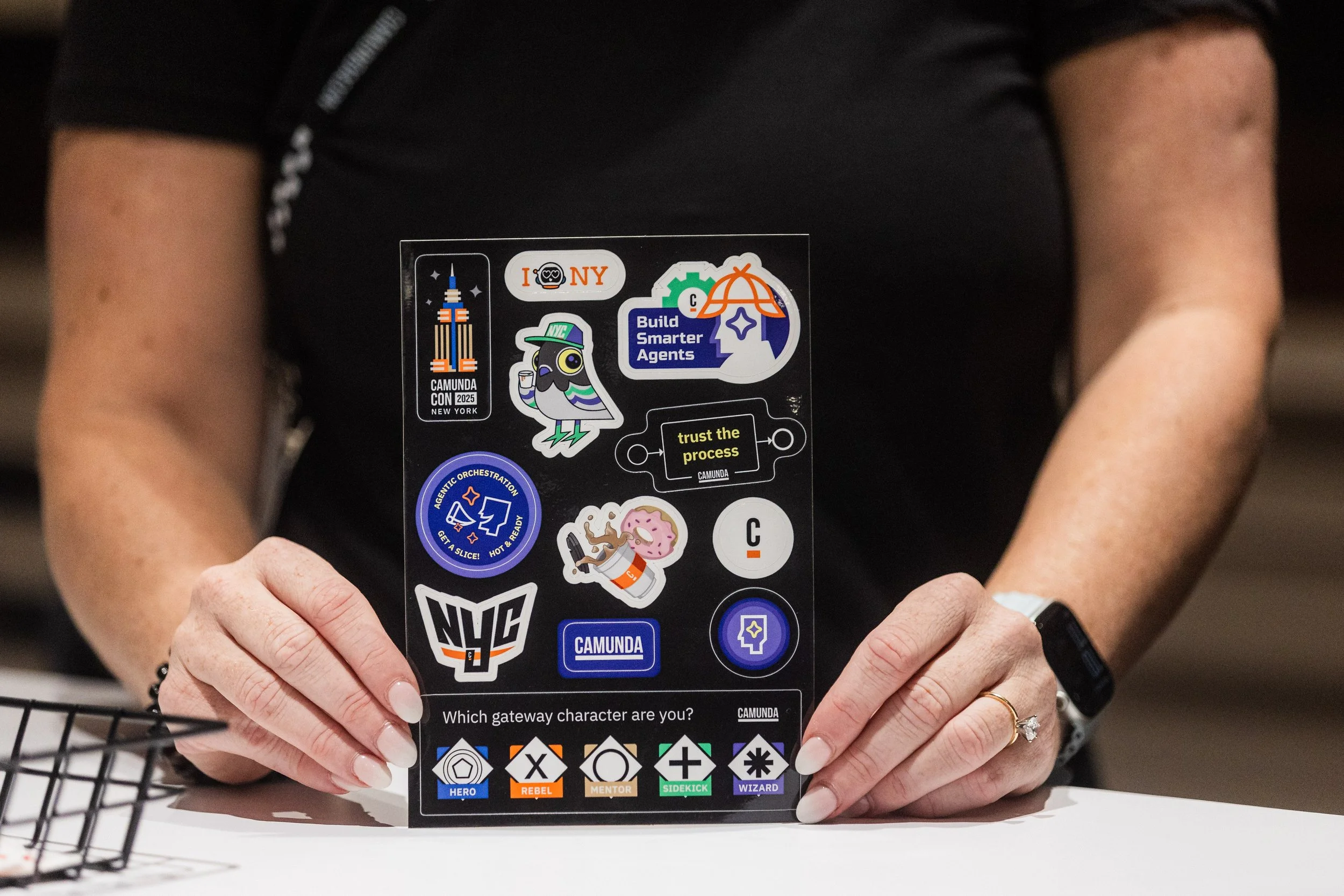
Our main outputs included stage branding, slideshow templates, venue signage/directionals, social assets, and DG items. Us brand folks also really love swag items like sticker sheets, so of course that was also a priority.
Overview
CamundaCon is Camunda’s flagship event that gathers clients, partners, and the broader process orchestration community together for talks, demos, and networking. Camunda hosts two CamundaCons per year—one in Europe and one in the United States. Given its prominence for Camunda’s brand awareness, it was critical to craft a cohesive and memorable visual experience.
My Role: Defining the Brand
I led the visual direction for CamundaCon NYC, defining the event’s brand system, design principles, and guidelines. I partnered closely with the rest of our lovely brand team to enable consistent execution across signage, stage design, booth environments, presentation materials, and digital outputs. Our applied visual system reached and garnered 1500+ digital registrations and 400+ in-person registrations through email, social, and web outputs.
Design Strategy
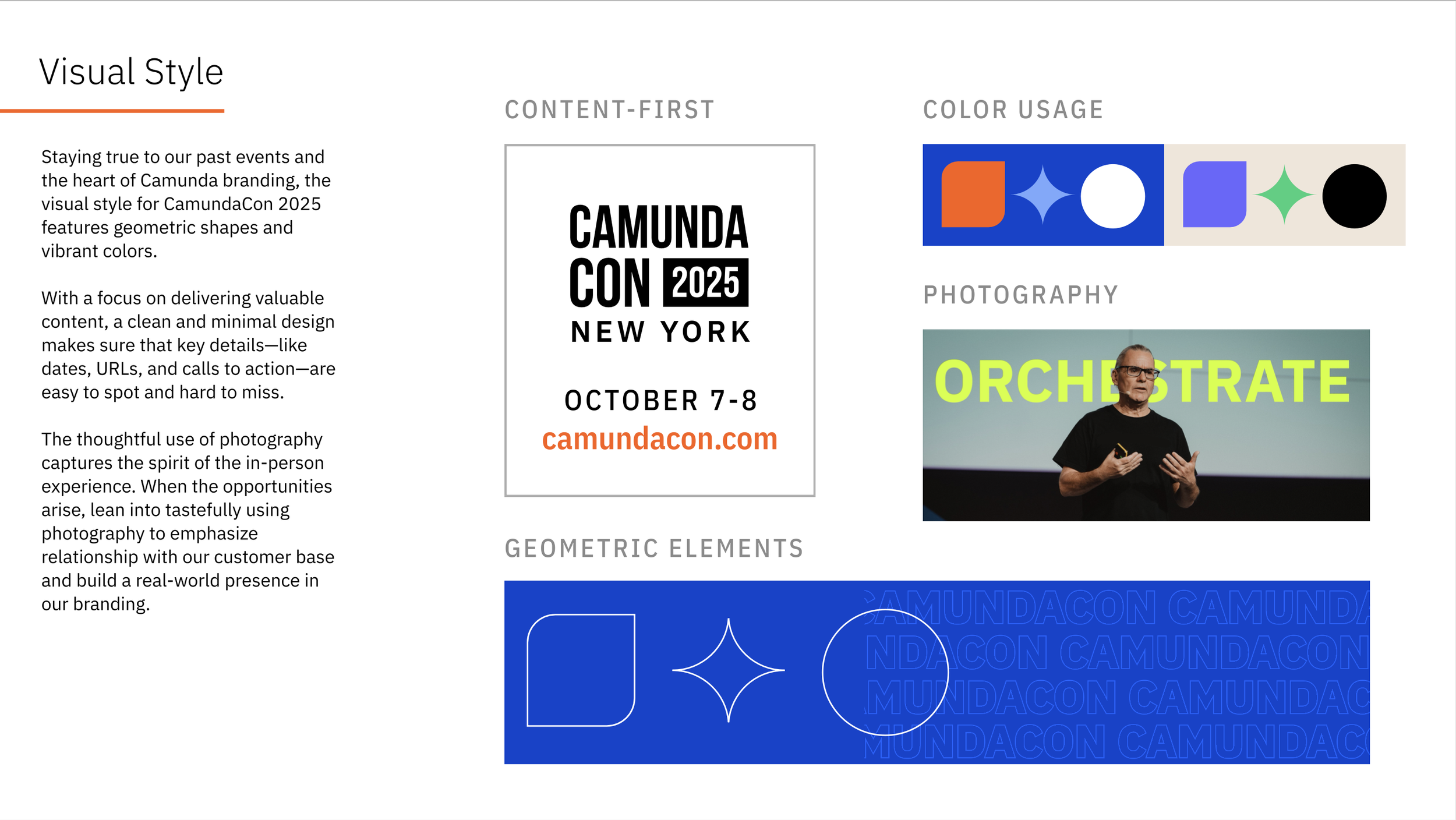
It was important to complement Camunda’s refined-yet-playful brand with New York City’s bold, structured visual language. The goal was to create a brand experience with strong presence—one that felt confident, agile, and distinctly Camunda in a fast-paced, physical environment.
Drawing inspiration from crosswalks, city blocks, and repeating architectural patterns, the system was designed to scale across formats while remaining flexible for rapid production and on-site execution.
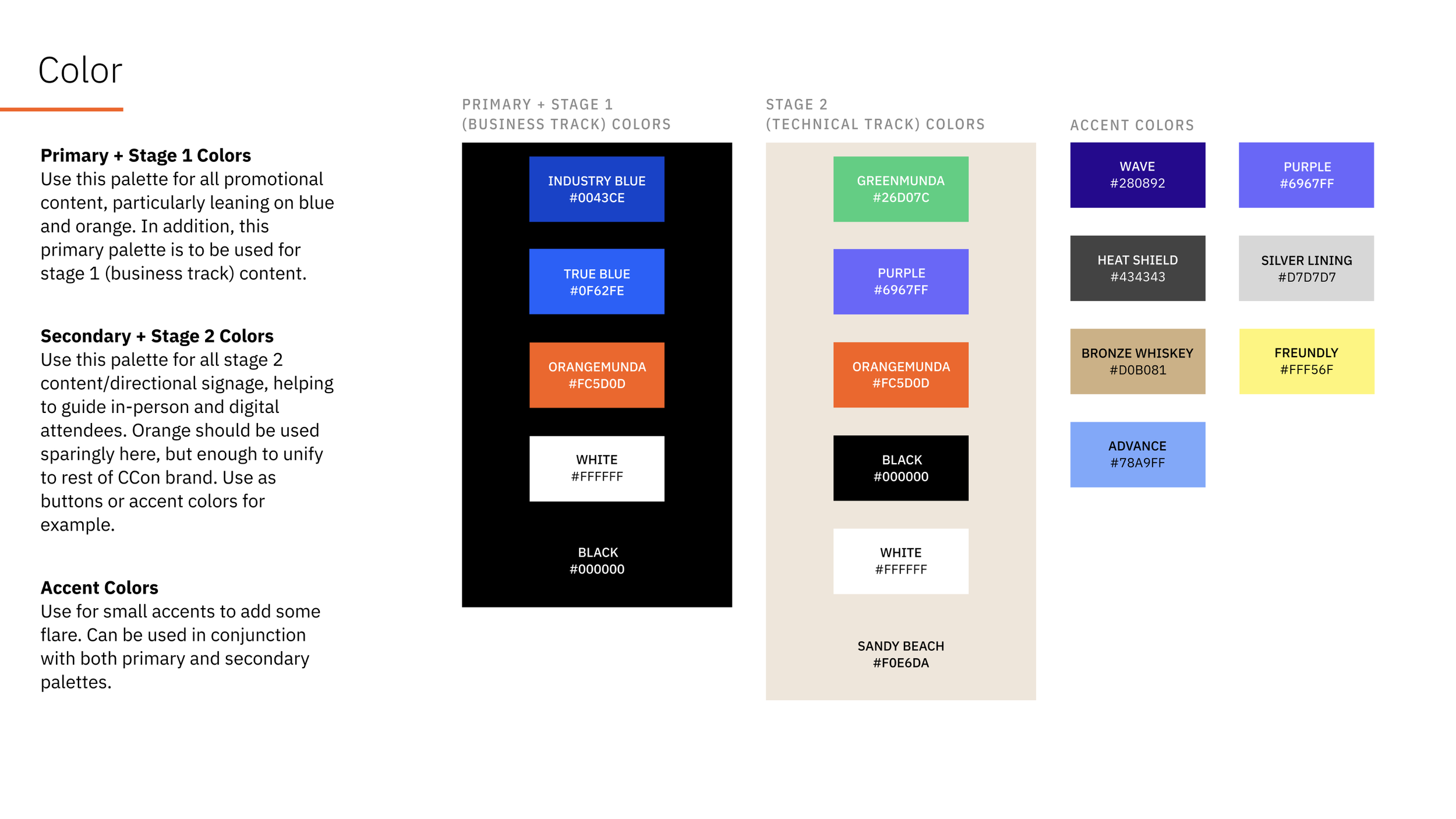
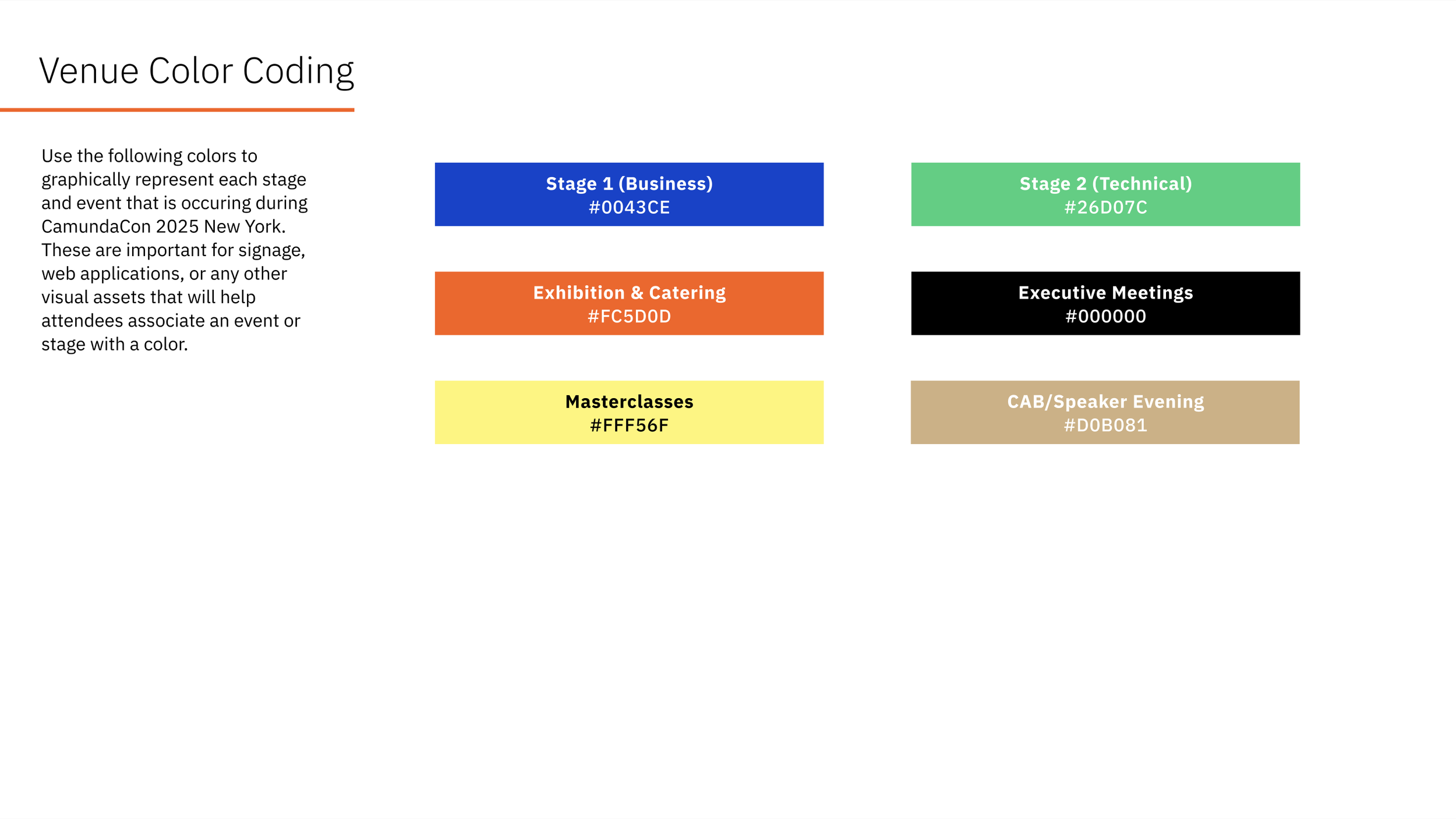
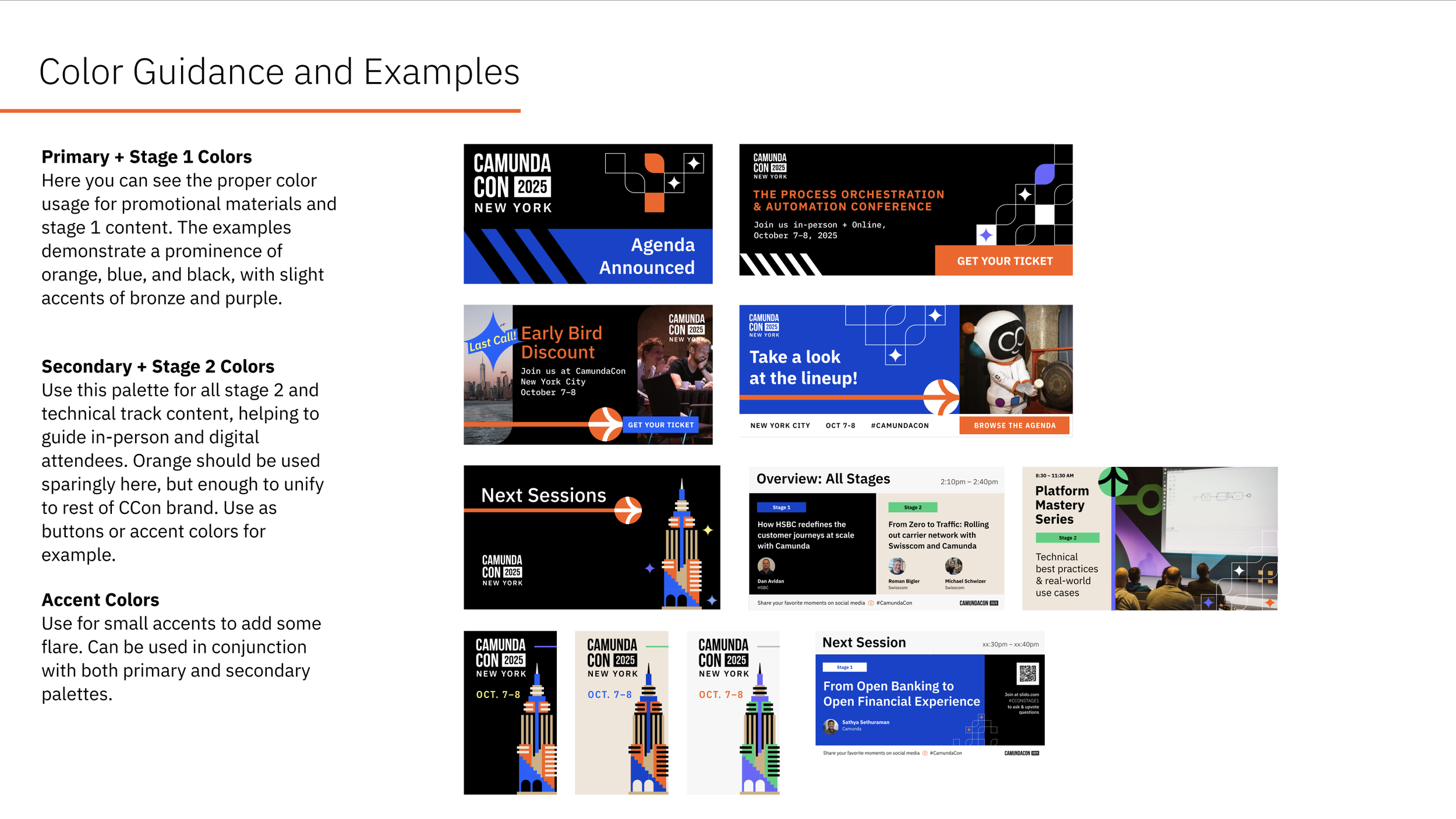
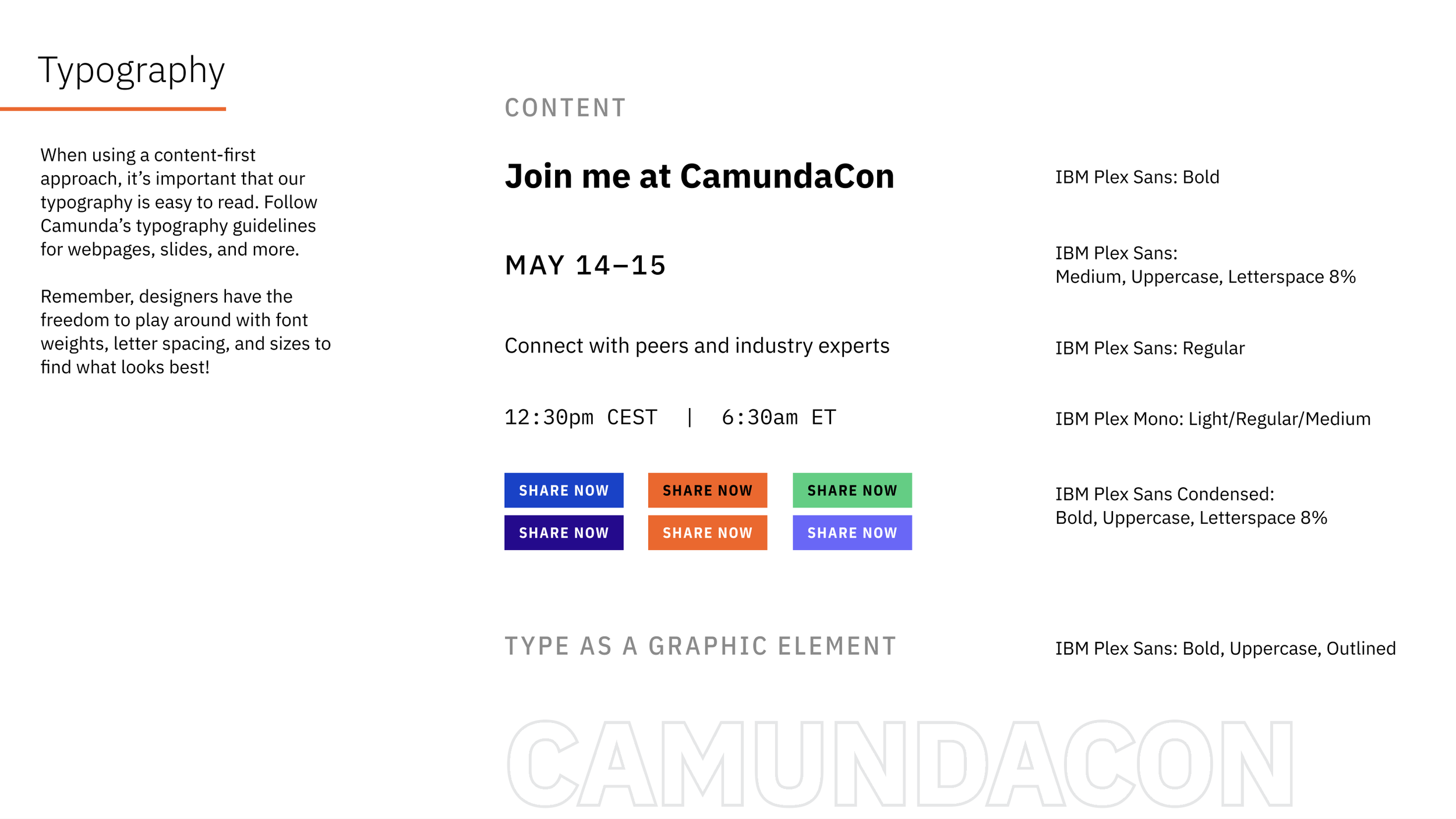
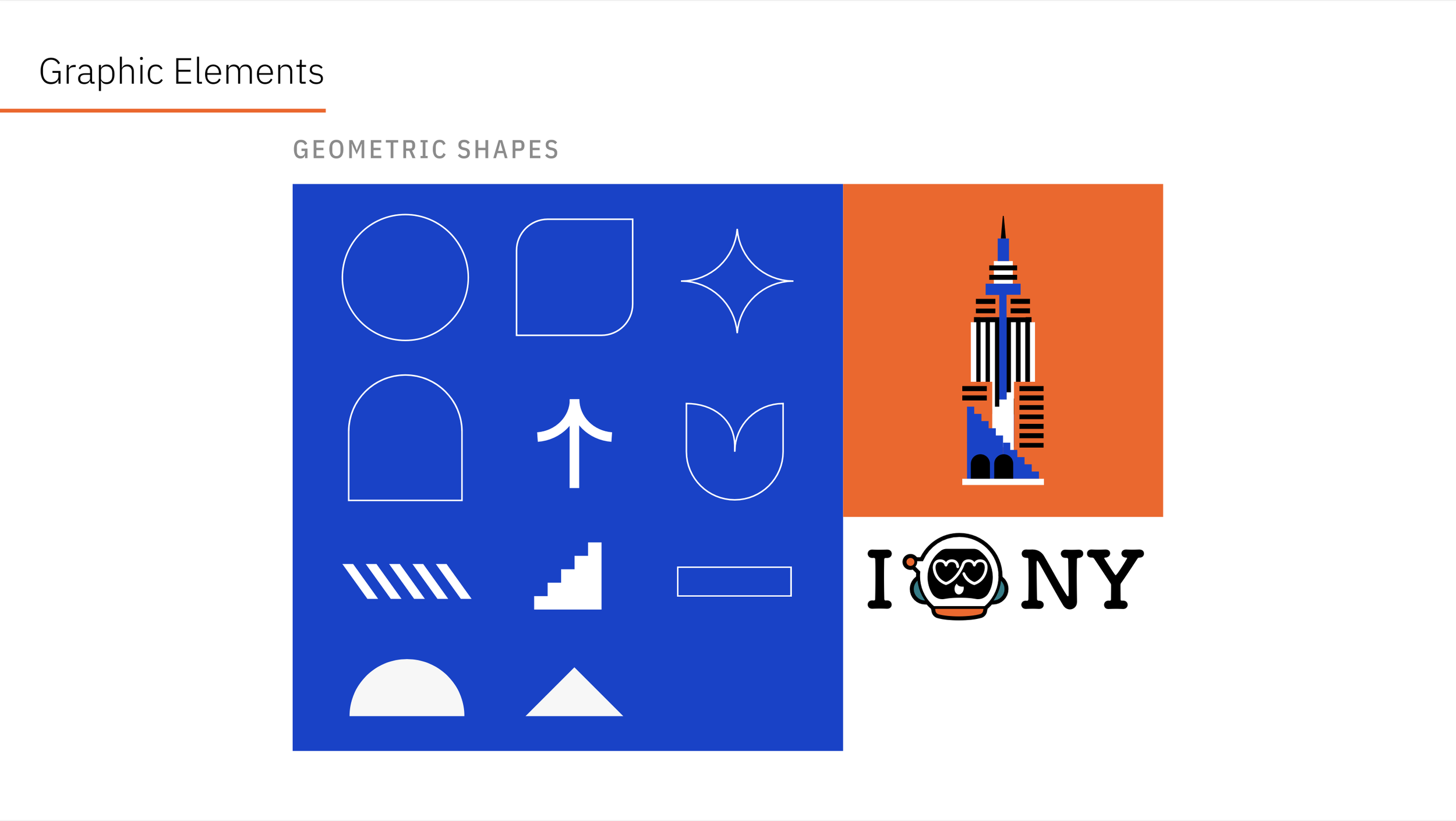
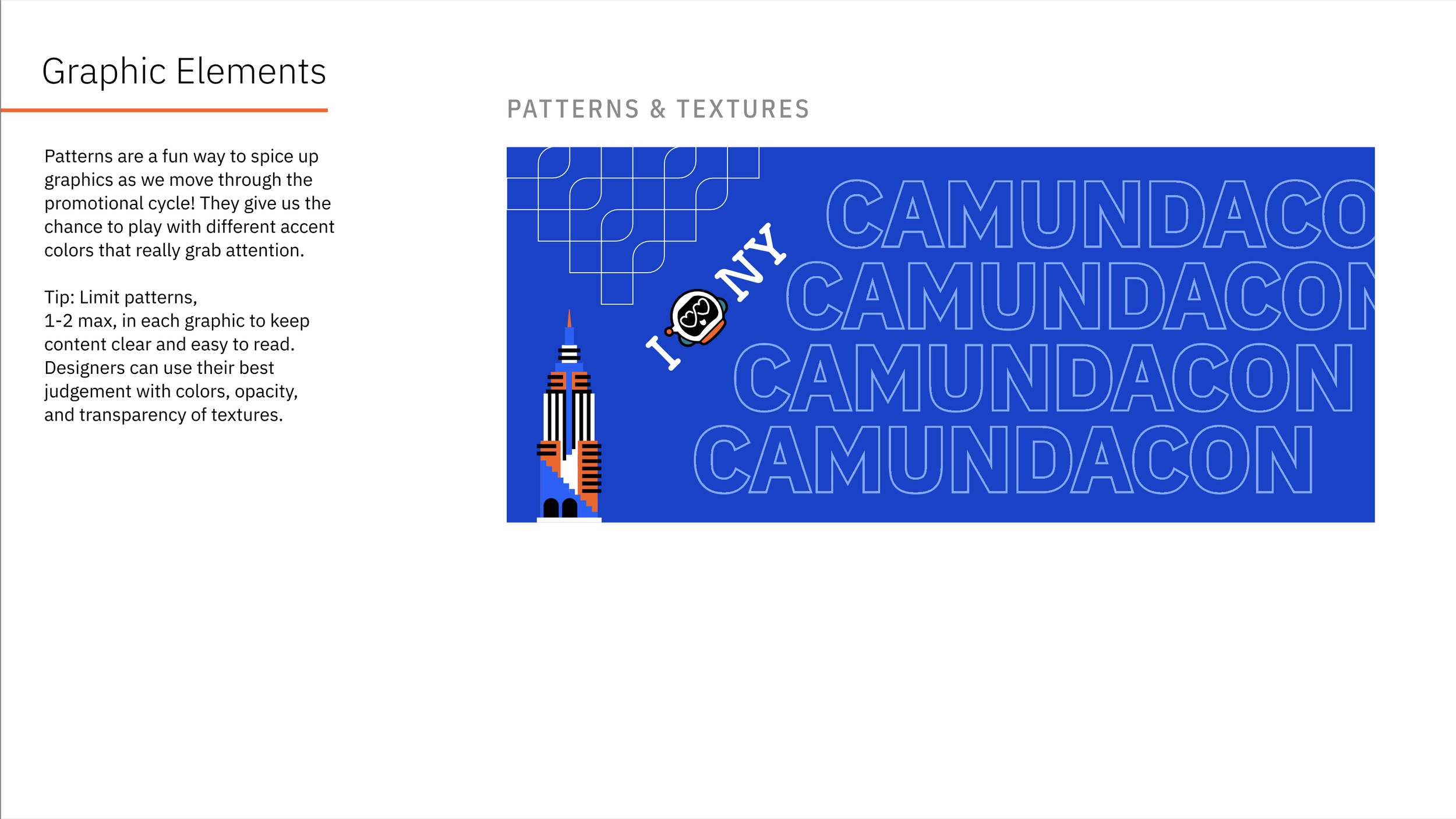
The Visual System
Please use the left and right arrows below to view the highlights of our brand guideline. Click here to view the entire guidelines PDF.
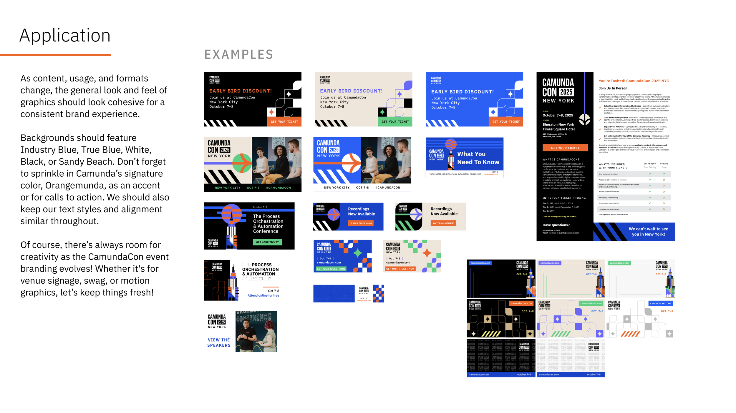
Brand in Action
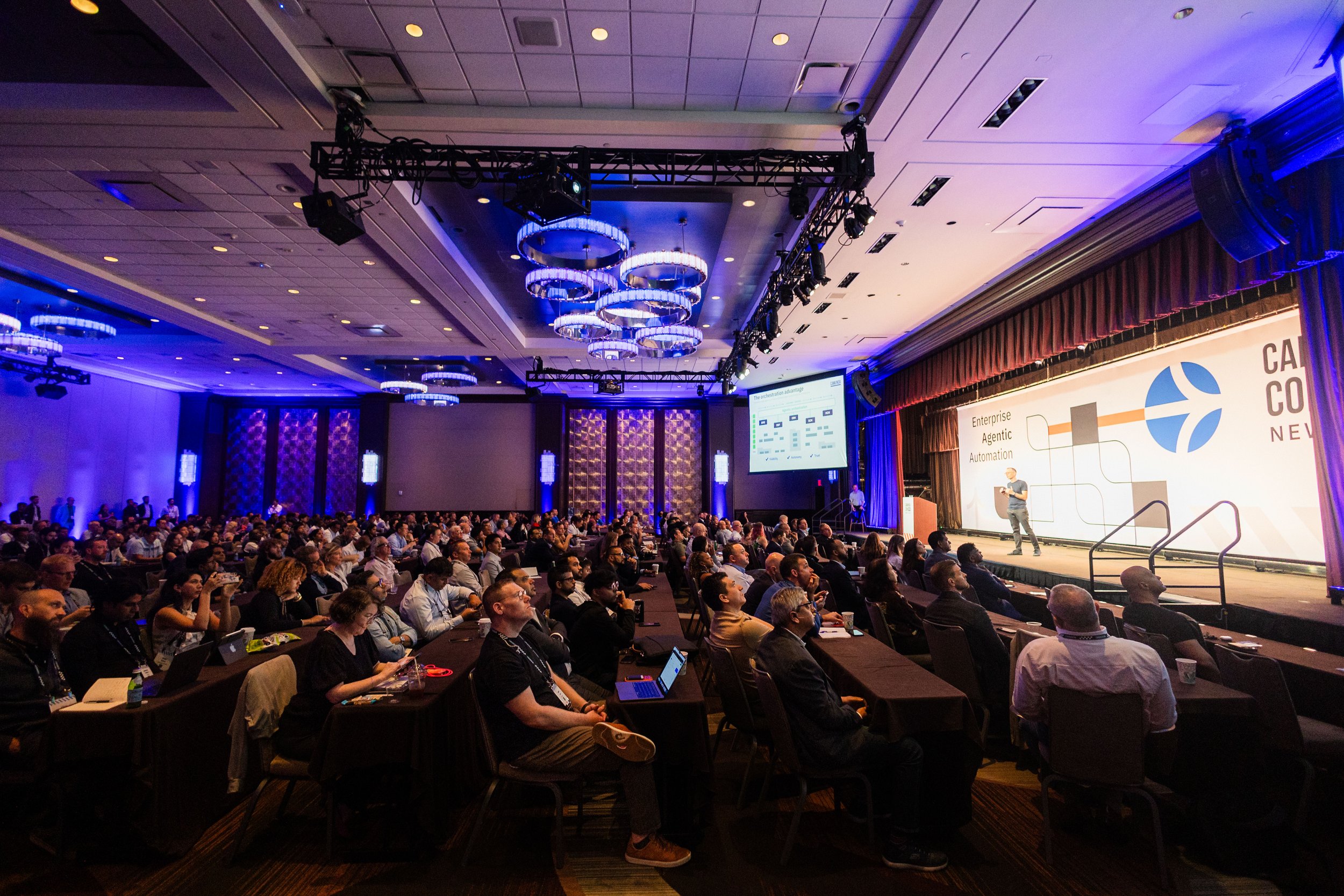
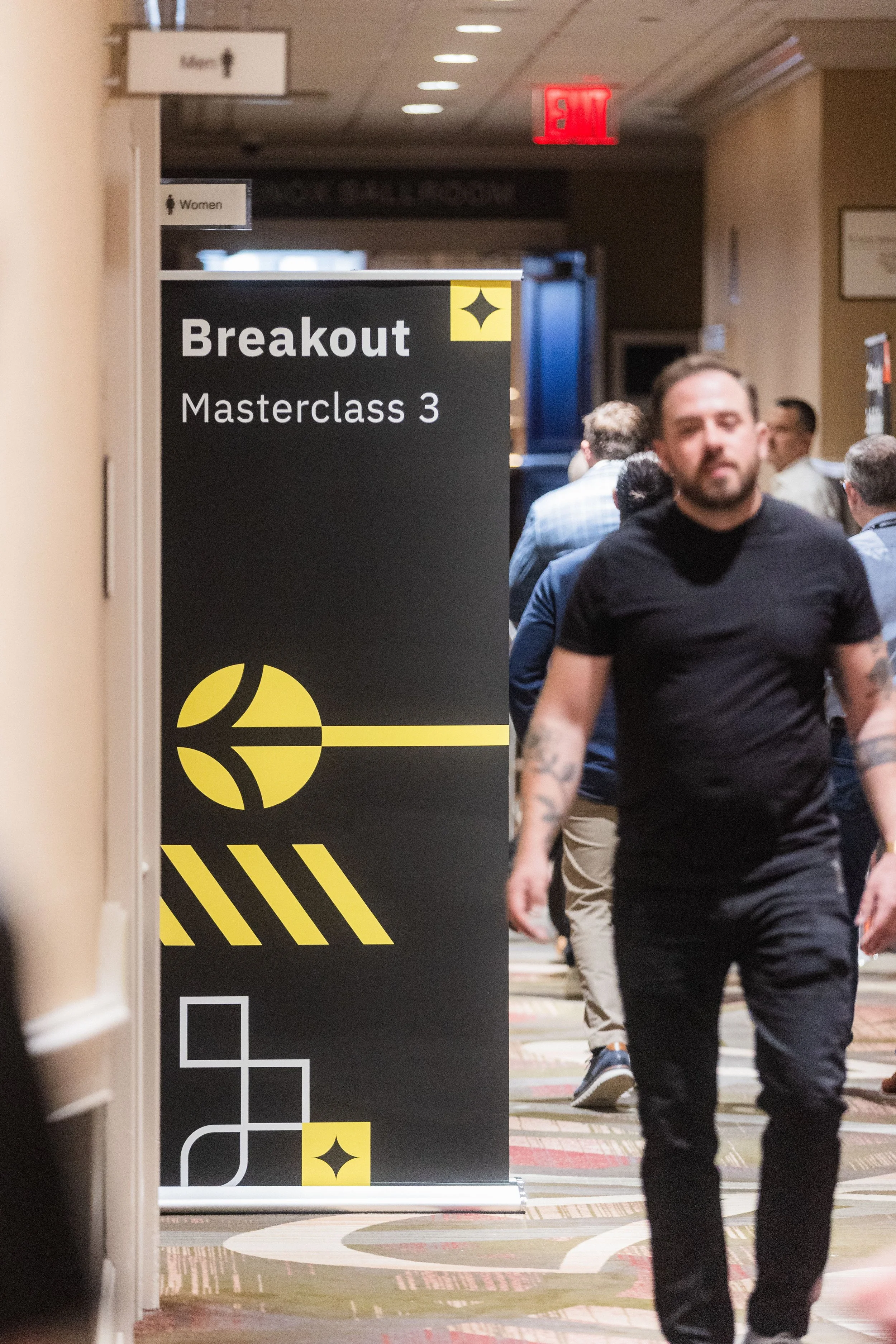
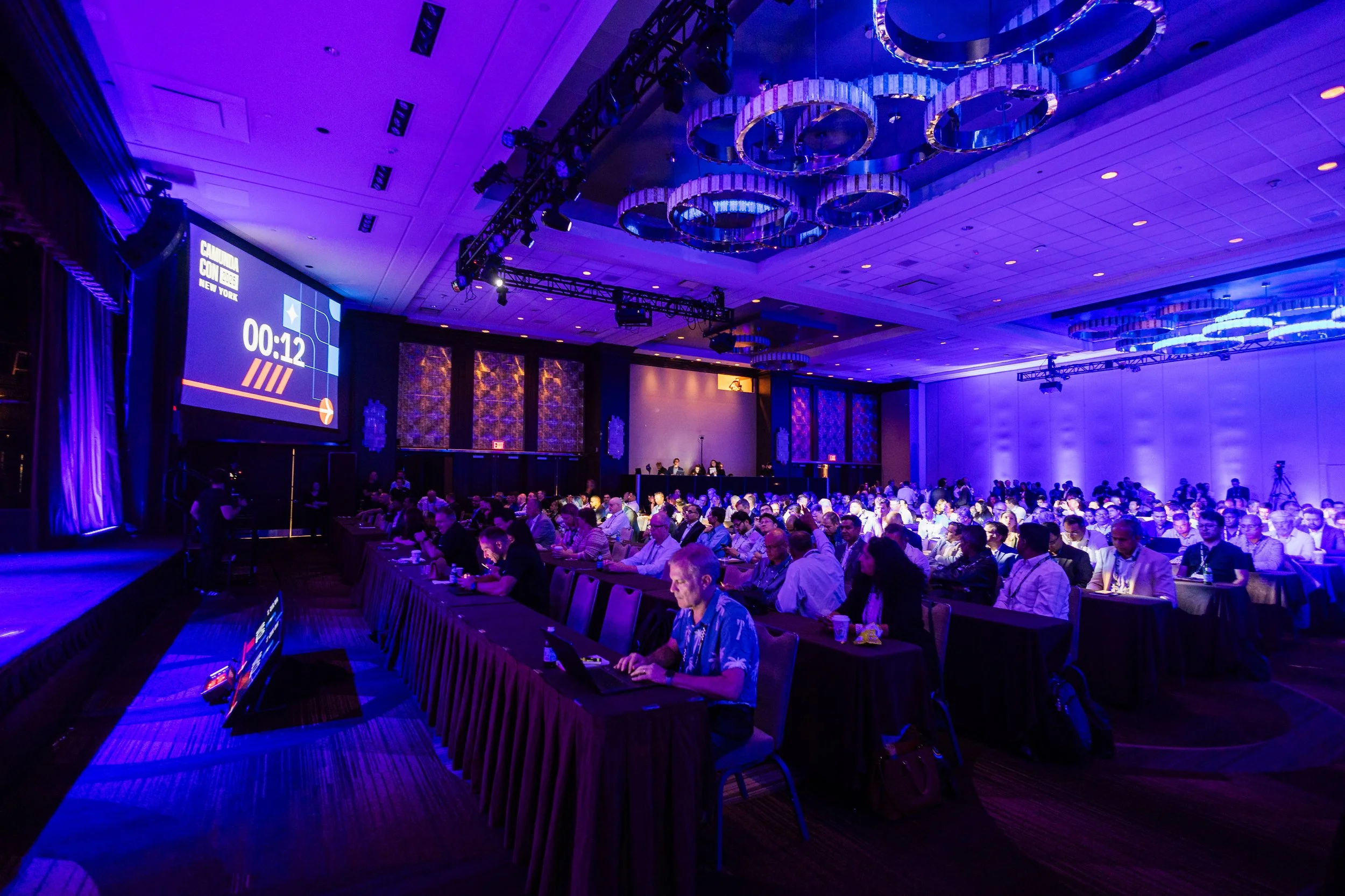
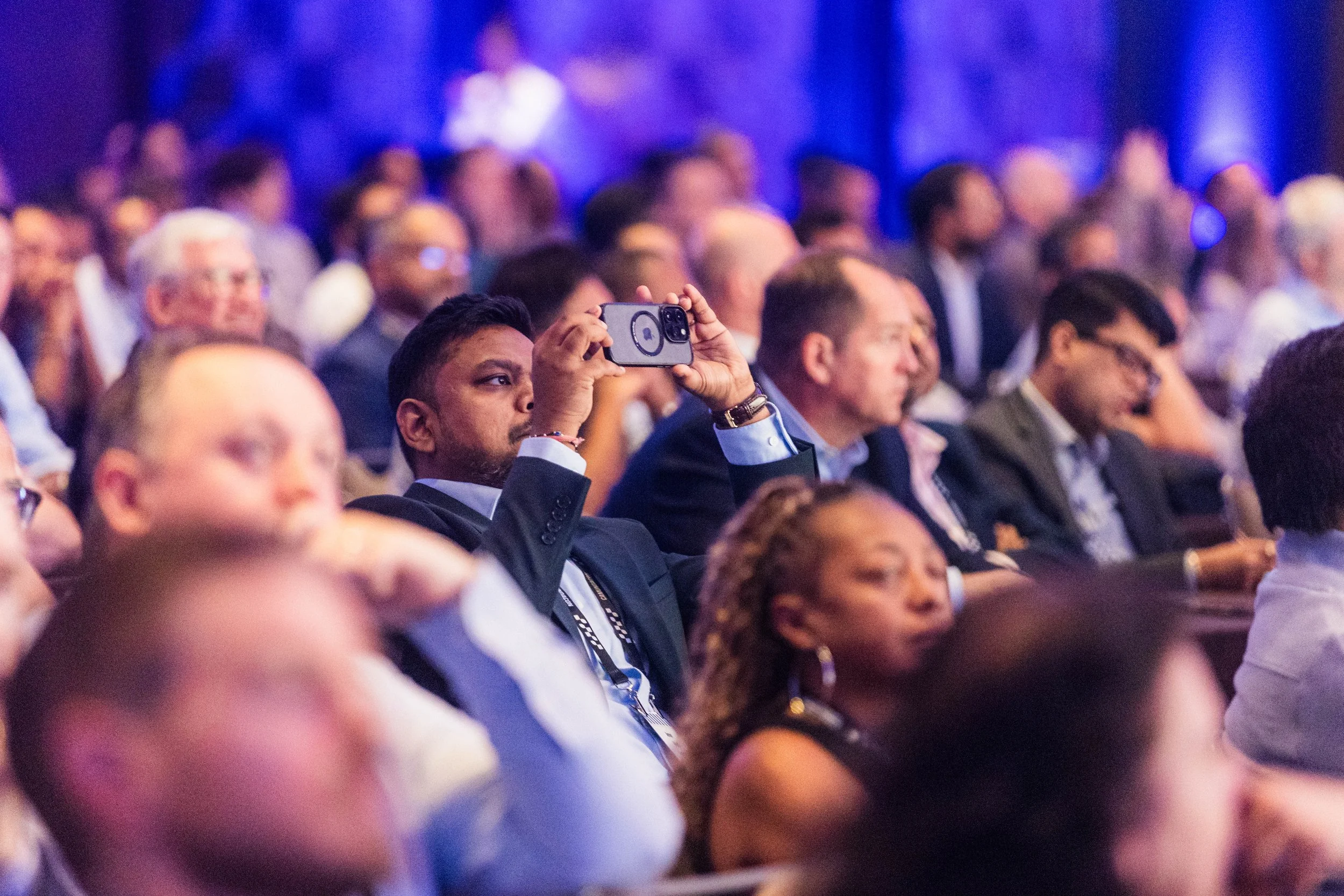
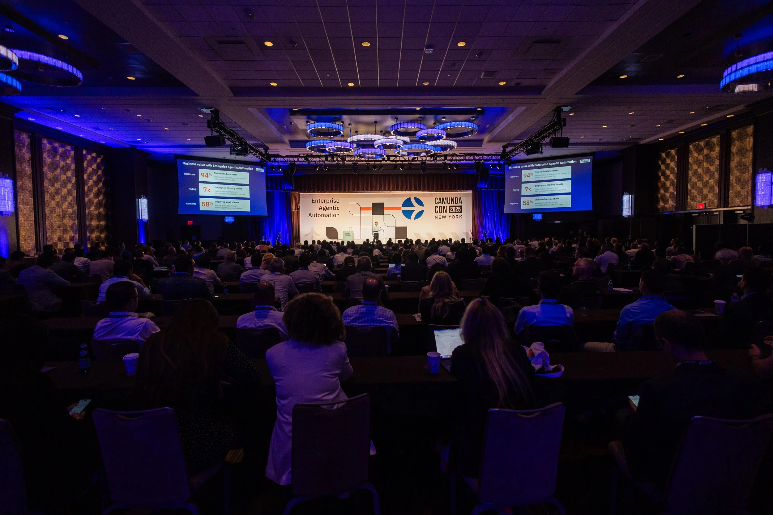
Application of our visual system across the venue to create a cohesive attendee experience
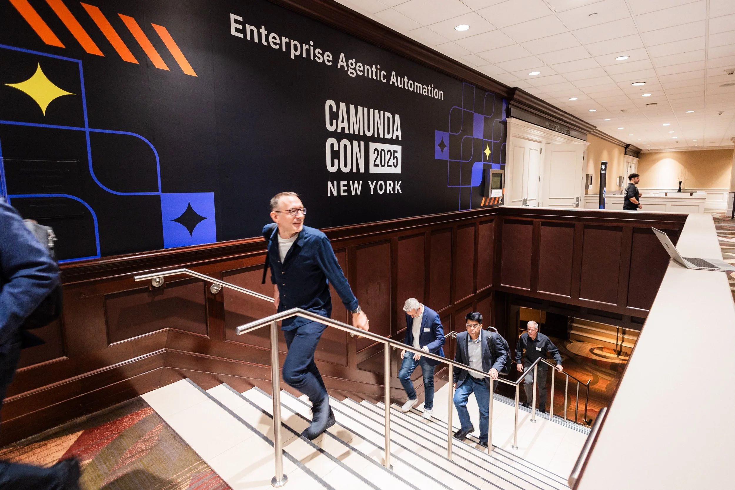
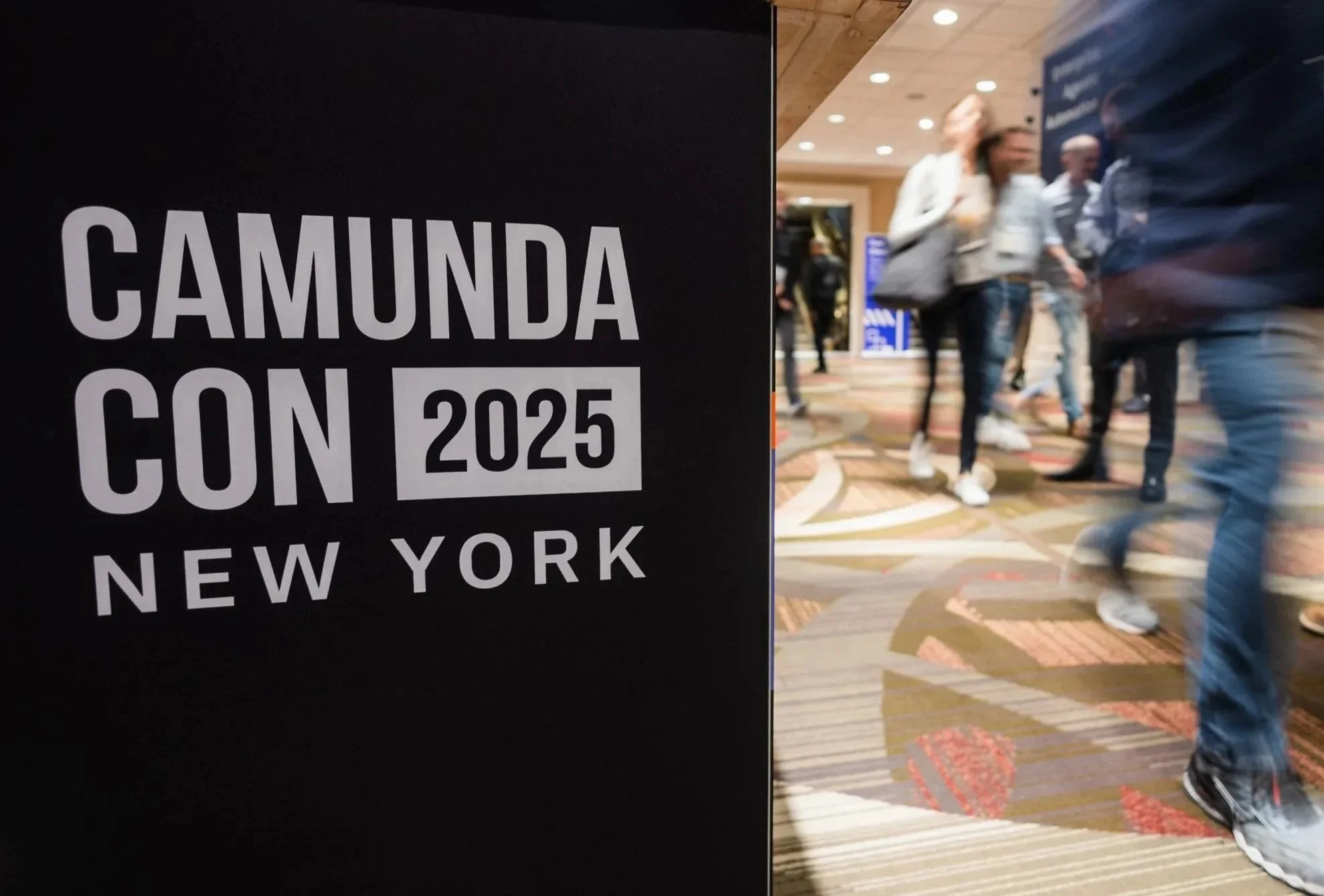
Environmental branding and directionals
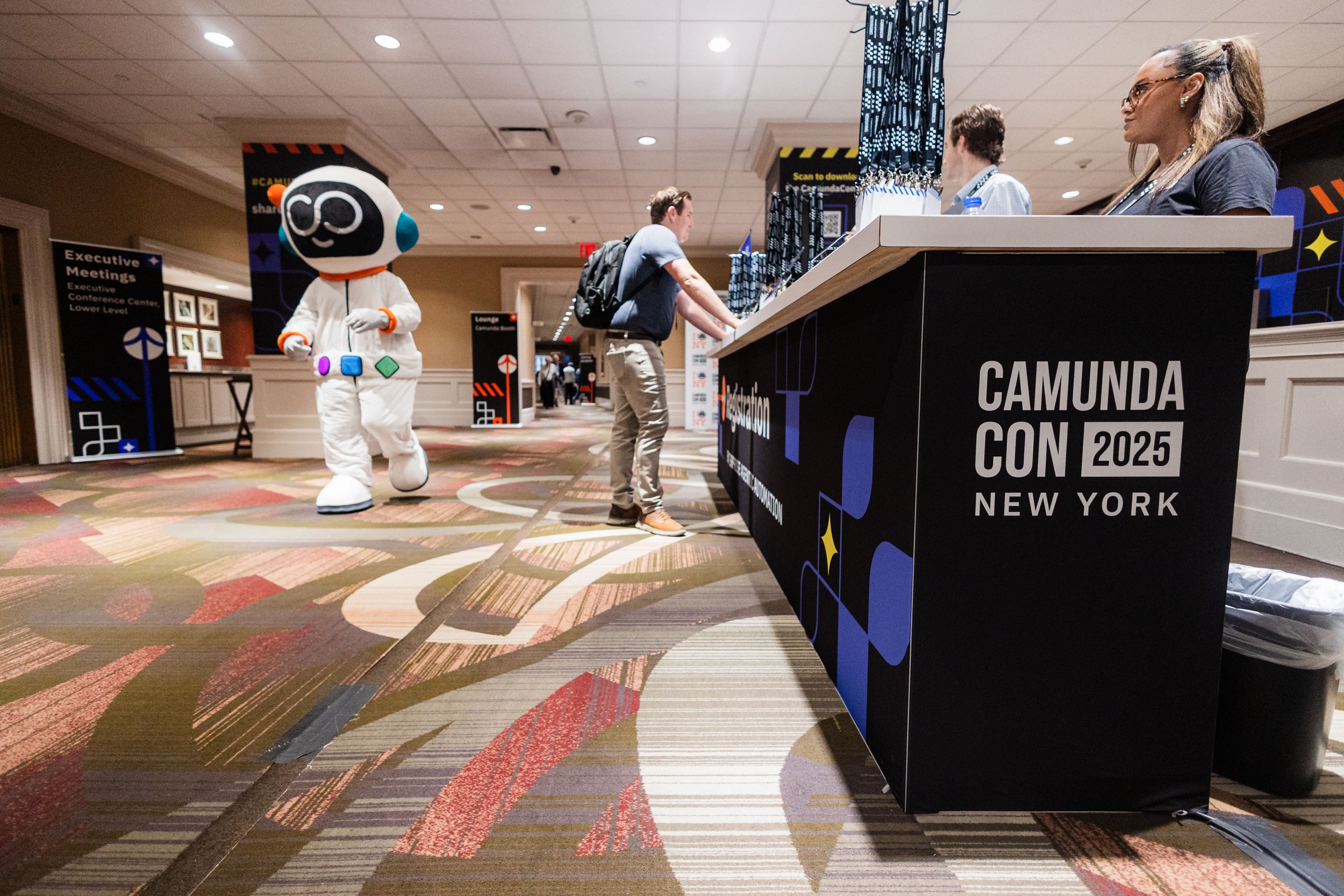

Stages

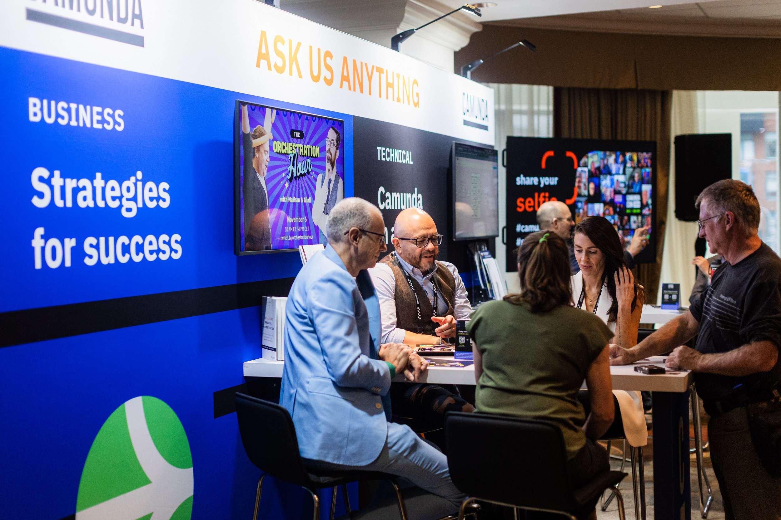
Booths and experiential branding

Outcome and Impact
Successful branding supports the experience rather than competing with it. Through consistent application of the visual system, CamundaCon NYC was intuitive to navigate, visually engaging, and designed to foster connection among attendees.
The event received positive feedback from both attendees and installation partners, who noted the clarity, cohesion, and overall quality of the branding across the venue. The system felt intentional and fresh while remaining distinctly Camunda.
Presentation templates enabled speakers to focus on delivering their content while contributing to a cohesive, end-to-end brand experience across sessions.
Reflection
While the visual system successfully elevated CamundaCon NYC above standard, cookie-cutter tech events, the live environment presented opportunities for refinement.
In certain areas, printed materials became visually dense. Introducing more negative space and reducing decorative elements would improve visual pacing and give attendees moments of rest within an already stimulating environment.
Additionally, future iterations could benefit from exploring a lighter base color in place of black. While effective for contrast, the darker foundation—paired with strong architectural motifs—occasionally felt visually heavy in large-scale environments.